WP_Query Object
(
[query] => Array
(
[paged] => 7
[pagename] => blog
)
[query_vars] => Array
(
[paged] => 7
[pagename] => blog
[error] =>
[m] =>
[p] => 0
[post_parent] =>
[subpost] =>
[subpost_id] =>
[attachment] =>
[attachment_id] => 0
[name] =>
[page_id] => 0
[second] =>
[minute] =>
[hour] =>
[day] => 0
[monthnum] => 0
[year] => 0
[w] => 0
[category_name] =>
[tag] =>
[cat] =>
[tag_id] =>
[author] =>
[author_name] =>
[feed] =>
[tb] =>
[meta_key] =>
[meta_value] =>
[preview] =>
[s] =>
[sentence] =>
[title] =>
[fields] => all
[menu_order] =>
[embed] =>
[category__in] => Array
(
)
[category__not_in] => Array
(
)
[category__and] => Array
(
)
[post__in] => Array
(
)
[post__not_in] => Array
(
)
[post_name__in] => Array
(
)
[tag__in] => Array
(
)
[tag__not_in] => Array
(
)
[tag__and] => Array
(
)
[tag_slug__in] => Array
(
)
[tag_slug__and] => Array
(
)
[post_parent__in] => Array
(
)
[post_parent__not_in] => Array
(
)
[author__in] => Array
(
)
[author__not_in] => Array
(
)
[search_columns] => Array
(
)
[ignore_sticky_posts] =>
[suppress_filters] =>
[cache_results] => 1
[update_post_term_cache] => 1
[update_menu_item_cache] =>
[lazy_load_term_meta] => 1
[update_post_meta_cache] => 1
[post_type] =>
[posts_per_page] => 4
[nopaging] =>
[comments_per_page] => 50
[no_found_rows] =>
[order] => DESC
)
[tax_query] => WP_Tax_Query Object
(
[queries] => Array
(
)
[relation] => AND
[table_aliases:protected] => Array
(
)
[queried_terms] => Array
(
)
[primary_table] => kw_posts
[primary_id_column] => ID
)
[meta_query] => WP_Meta_Query Object
(
[queries] => Array
(
)
[relation] =>
[meta_table] =>
[meta_id_column] =>
[primary_table] =>
[primary_id_column] =>
[table_aliases:protected] => Array
(
)
[clauses:protected] => Array
(
)
[has_or_relation:protected] =>
)
[date_query] =>
[queried_object] => WP_Post Object
(
[ID] => 84
[post_author] => 1
[post_date] => 2016-09-19 09:26:41
[post_date_gmt] => 2016-09-19 09:26:41
[post_content] =>
[post_title] => Articles & Resources
[post_excerpt] =>
[post_status] => publish
[comment_status] => closed
[ping_status] => closed
[post_password] =>
[post_name] => blog
[to_ping] =>
[pinged] =>
[post_modified] => 2020-10-01 17:51:51
[post_modified_gmt] => 2020-10-01 17:51:51
[post_content_filtered] =>
[post_parent] => 0
[guid] => http://keywebconcepts.com/?page_id=84
[menu_order] => 21
[post_type] => page
[post_mime_type] =>
[comment_count] => 0
[filter] => raw
)
[queried_object_id] => 84
[request] => SELECT SQL_CALC_FOUND_ROWS kw_posts.ID
FROM kw_posts
WHERE 1=1 AND ((kw_posts.post_type = 'post' AND (kw_posts.post_status = 'publish' OR kw_posts.post_status = 'acf-disabled')))
ORDER BY kw_posts.menu_order, kw_posts.post_date DESC
LIMIT 24, 4
[posts] => Array
(
[0] => WP_Post Object
(
[ID] => 6376
[post_author] => 1
[post_date] => 2017-09-12 10:10:39
[post_date_gmt] => 2017-09-12 15:10:39
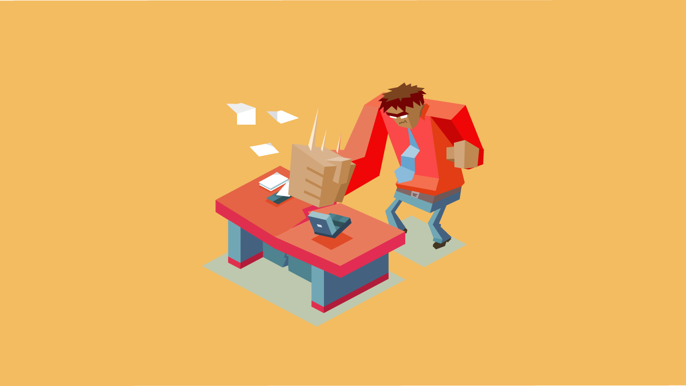
[post_content] => Most businesses know that having a website is crucial for maximizing sales since shopping, marketing, and researching are very commonly done online. But what if your website isn’t helping you reach those potential customers? What if it’s actually driving away your customers?
Unfortunately, this happens more than you’d think. Online customers want quick answers, easy finds, and not to be overwhelmed when browsing a site. It is very easy for your customers to click to another company’s site that is more user friendly, so you want to be sure that your site is inviting to potential customers.
So if you’re worried that your website isn’t bringing in as many potential customers as it could be, then this could be why:
Confusing Structure
The structure of your website has a huge impact on your customers because if they aren’t able to find what they need on your site then they aren’t going to use it. A confusing structure could be a poorly composed homepage layout, an unorganized navigational menu, or having an overload of subpages. All of these could lead to your customers not being easily directed to the answers they’re looking for on your site.
Another thing to look out for besides a confusing structure is an overwhelming home page. If you have too much going on throughout your home page (maybe a pop-up ad or music or a video that plays automatically) then your customers could be bouncing right off your site. Your users don’t want to have to find an exit or pause button if they aren’t interested in your site’s antics. A simple, well-organized homepage with your customers and target audience in mind is what will keep your customers on your site.
Here at Key Web Concepts, our designers carefully think about the structure of each and every website designed. The flow of the home page, the organization of the navigational menu, and where the call-to-action (like a “Call now” button) are placed are all well-thought-out to ensure your site creates a positive affect your customers.
Poor Content
Your website needs to be a place where future and current customers can gain information quickly and easily. So if your content is lengthy, uninformative, outdated, or poorly written, your customers could be taking their business to your competition. Poor content could also affect your google ranking as well, so it’s vital that you have updated and well-written content for SEO.
Content is huge for your website because it’s what is going to inform your customers of your products and services. Taking the time to write strong, interesting, and well-organized content will do your site (and your business) well. And if you find that you’re having trouble developing that content, it’s okay to ask for help. We have copywriters here that can provide well-written content for your site.
Another thing to consider is updating your blog or news section regularly. Of course, that is important for SEO as well, but if a customer visits a page where the last event or blog posted was in 2015, they might not trust your site’s information anymore as it will feel outdated. If you’re going to have a blog or news section (which we think you should!) be sure that you keep it up-to-date, or you hire someone to keep it up-to-date for you.
Wrong Target Audience
Your target audience is who you think will benefit from your product or service, and in turn, who will be benefiting from your site. The language, images, and overall design of your site should be geared towards your average client. Therefore, you wouldn’t want to include items that might confuse or drive away your average customer.
Creating a website around your target audience allows your site to reach maximum potential. Remember, your site is not for you but instead for your clients. Take a look at your average client and ensure that you are providing them with a website that will cater to their needs.
Knowing your target audience is crucial for not only your website but your brand as a whole. Consistent branding will help all of your marketing efforts (website, social media, and more) come together to directly influence your target audience.
These are the top three reasons why your site could be sending away business. Hopefully, you’re reading this and going “Phew, I passed that test!” But if you’re unsure, send us a message. We’d be happy to assess your site to see what is and isn’t working.
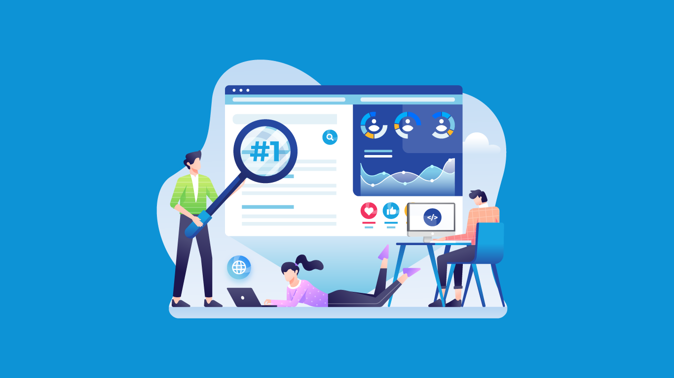
[post_title] => Top 3 Reasons Your Site is Sending Customers Away
[post_excerpt] =>
[post_status] => publish
[comment_status] => open
[ping_status] => open
[post_password] =>
[post_name] => top-3-reasons-your-site-is-sending-customers-away
[to_ping] =>
[pinged] =>
[post_modified] => 2020-10-22 12:54:10
[post_modified_gmt] => 2020-10-22 12:54:10
[post_content_filtered] =>
[post_parent] => 0
[guid] => https://keyweb31.com/stagekwc/?p=6376
[menu_order] => 0
[post_type] => post
[post_mime_type] =>
[comment_count] => 0
[filter] => raw
)
[1] => WP_Post Object
(
[ID] => 6342
[post_author] => 1
[post_date] => 2017-08-16 08:45:20
[post_date_gmt] => 2017-08-16 13:45:20
[post_content] => Search engine optimization (SEO) is a way of getting quality traffic to your site using a search engine such as Google. Proper SEO (sometimes called white hat SEO) means your site will be found organically with strong, useful keywords and appropriate SEO tactics. But sometimes, SEO specialists will use inappropriate SEO tactics to get sites ranked higher. Black hat SEO is when a site uses a plethora of bad SEO techniques to “trick” search engines into ranking them higher. Black hat SEO is against those search engine terms, and if your site is caught using them then your site could be penalized and even potentially be removed from the search engine’s web index. Meaning, you won’t show up on Google at all.Kind of scary, huh? But if knowledge is power then be thankful you landed on this post. Below are a list of black hat SEO techniques that you should be aware of, especially if you outsource for SEO. Protect your site and be aware that some SEO specialist aren’t looking out for your site’s best interests, especially if they’re using these black hat SEO tactics.
Keyword Stuffing
Keyword stuffing is when the content of a site is “spammed” with keywords that don’t make sense to human readers, but instead make sense to Google bots. When these bots read the site and recognize the keywords, they might rank the site higher—but if Google catches on to keyword stuffing, then your site could be penalized. Keyword stuffing makes the content of a site unreadable or unpleasant to read, which means your users suffer the most. An example would be something like: “If you need a website designed, have our web designers design you a website with their super web design powers because they do web designing and design websites.” Because your site’s user experience is crucial for its success, keyword stuffing is not the way to move up on Google.
Duplicating Content
This comes in a variety of forms. One of which, is when website builders build multiple pages on a site that essentially contain the same content, but is titled differently and reworded very slightly. This can cause the site to appear larger to search engine bots, when in reality, the user receives nothing but poor content. Another form of duplicate content is plagiarism. If someone is copying your site’s content, unfortunately Google bots won’t be able to make a distinction on which one came first, so their site could be ranked higher than yours even though your site has the original content. Black hat SEO users know that search engines bots lack that feature, and by stealing your content, they could be climbing up the rankings and knocking yours down. Do a simple search of your site’s content to be sure that no one is duplicating it and if they are it, report it here.
Link Farming
Link farming is when there is a network of sites that have no similarities yet are all interlinked to each other in an attempt to boost their ranking. While linking does make for good SEO practices, if the links don’t provide the user with useful information, then they’re nothing but deceiving. Another black hat SEO term that involves poor linking is called doorway pages. These are pages that serve no purpose but to trick google into thinking the site is larger than it is. These pages usually have nothing but maybe a paragraph of text that often is usually just stuffed keywords, but to google’s bots, they might appear more purposeful. It’s important that your site does not contain doorway pages or link farms because google would penalize you if discovered, and in some cases ban you.
Using Hidden Texts
Hidden texts are when content (text, images, or links) are invisible to the users, but search engines can see them. This can be done by either making the text smaller or changing the color of the text to match the background of the site. This is a way that spammers can keyword stuff without causing confusion to their users. However, Google is becoming more and more aware of hidden texts, and again if your site is caught using it, you could be penalized or banned.
Cloaking
Cloaking is probably the most dangerous form of black hat SEO. Google describes cloaking as “the practice of presenting different content or URLs to human users and search engines.” Meaning, what the search engine bots read is completely different from what a human would read. An example of this might be that google bots read a page of text (usually stuffed keywords) while users simply see an image. Cloaking is also used in a lot of hacking incidents, because it’s harder for the site owner to identify. But once Google detects that a site has been using cloaking for SEO purposes, the site could be removed from their indexes and will become unsearchable.If you are concerned that your SEO specialist is using any of these tactics to increase your site's rankings, please know that it is only a matter of time before Google catches on and your site will be penalized, if not banned. A site that is attempting to trick Google is a not a site that Google wants in their index, so implementing these tactics could be detrimental to your site’s SEO.Appropriate SEO specialists will not use black hat SEO. Instead, they will use appropriate SEO tactics to increase your site’s ranking organically. Being removed from Google is not a situation you want your site to be in and it could ultimately cause you to lose out on a lot of business, so be sure that your SEO specialists are looking out for your company’s best interest by following the search engine’s guidelines and rules.
If you need help with your site’s SEO, let us know. We only practice appropriate SEO tactics and would be happy to help you increase your SEO standings organically and rightfully.
[post_title] => What You Need to Know About Black Hat SEO
[post_excerpt] =>
[post_status] => publish
[comment_status] => open
[ping_status] => open
[post_password] =>
[post_name] => what-you-need-to-know-about-black-hat-seo
[to_ping] =>
[pinged] =>
[post_modified] => 2020-08-09 02:01:25
[post_modified_gmt] => 2020-08-09 02:01:25
[post_content_filtered] =>
[post_parent] => 0
[guid] => https://keyweb31.com/stagekwc/?p=6342
[menu_order] => 0
[post_type] => post
[post_mime_type] =>
[comment_count] => 0
[filter] => raw
)
[2] => WP_Post Object
(
[ID] => 6291
[post_author] => 1
[post_date] => 2017-07-31 09:03:33
[post_date_gmt] => 2017-07-31 14:03:33
[post_content] => Having a strong user experience is crucial for your website’s success—after all, the whole reason you have a website is so users will use it, right? Well, if your website has poor usability, your current and/or potential clients won’t take advantage of it, meaning your website won’t fulfill its purpose. So what makes for a good user experience? There’s a lot that factors into a site’s usability and it’s important that your users’ experience is at the forefront of your website’s design. Here, at Key Web Concepts, the user experience is vital to each website we create, so we’ve compiled a few tips for you to ensure that your website has the best user experience it possibly can.
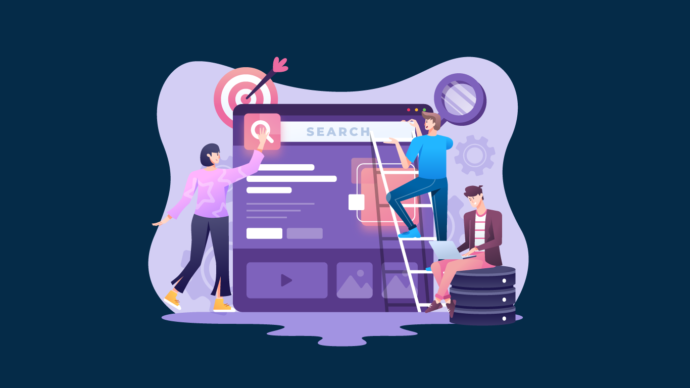
Create Easy Navigation
Simple navigation allows for your users to browse through your site with ease. They can access the information they need quickly when the menu is well-thought out and simplified. Overloading menus with too many options will cause your menu to seem cluttered which could negatively affect your user's experience. Simple and clean menus will allow for easier navigation.Another thing to consider is a well-organized menu. If I’m looking for the cost of your services, I wouldn’t expect to find it on your “About” page. Instead, I’d look for it under the “Services” or “Investment” pages. Be sure that your users won’t get frustrated hunting down information by creating a simple, clean, and well-organized navigational menu.
Use Call to Actions
Call to Actions are buttons or sections that prompts users to act. You see these CTAs everywhere: typically they prompt you to participate or engage with the site by saying something similar to “Call now” or “Get a Quote.” Call to Actions allow you to highlight and make important information stand out for your users while also giving your site a strong layout. CTAs also help break up text so that your site isn’t overloading information onto your users. They are especially useful for mobile device users because they are easy to scroll to and find. CTAs make for excellent user experiences because they allow users to quickly engage with your site.
Make Sure Your Site is Mobile Friendly
We just posted a whole blog post dedicated to the importance of mobile friendly websites, but here’s a quick summary for you: the majority of your users will be on a mobile device. And if they can’t use your site easily, they aren’t going to use your site.
Use Bullet Points
Most users don’t read websites anymore—instead, they skim. Your users skim the headers, the bullet points, and shorter paragraphs to get the information they’re looking for as quickly as possible. So if there’s important info related to your business that you want your users to obtain then you should make it stand out, perhaps with a bullet-pointed list. Plus, bullet points make it easier for search engines to read your site, meaning you could rank higher on Google if they’re used.
Check your Links
Make sure that all of your hyperlinks are not only noticeable for users to click on but also that they are working. Broken links will only frustrate your users, so make sure you check your links before launching/posting and check them often. Plus, search engines might rank you lower if your links are broken, because it views the site as abandoned. Another idea is to make sure your links for other websites open in new tabs. Not only will this keep your website opened for your user, but it will also make it easy for your user to get back to exactly where they were on your site before exiting.
Find the Right Images
The user experience takes more into consideration than just the text of a website. No matter what kind of photos you’re using (stock photos or your own) be sure that they take on the vibe of your project and/or business. If your brand is directed towards children, use photos of children that give off a happy and playful vibe. If your brand is directed towards assisting those who have been abused, use images of hope and change. Images can completely change the way your user feels when he or she uses your site. Make sure that your brand is protected and reinforced by using images that strengthen your brand’s identity and energy. If you aren’t sure if your website has a strong user experience, then test it! Better yet, get someone who has never used your site before to test it. If you find that these first-time users are getting confused, aren’t finding the information they need in a timely manner, or don’t quite understand your brand, let us know. We can help make your website’s user experience the best it can be.
[post_title] => 6 Tips to Improve Your Site's User Experience
[post_excerpt] =>
[post_status] => publish
[comment_status] => open
[ping_status] => open
[post_password] =>
[post_name] => 6-tips-to-improve-your-sites-user-experience
[to_ping] =>
[pinged] =>
[post_modified] => 2020-08-09 18:32:30
[post_modified_gmt] => 2020-08-09 18:32:30
[post_content_filtered] =>
[post_parent] => 0
[guid] => https://keyweb31.com/stagekwc/?p=6291
[menu_order] => 0
[post_type] => post
[post_mime_type] =>
[comment_count] => 0
[filter] => raw
)
[3] => WP_Post Object
(
[ID] => 6164
[post_author] => 1
[post_date] => 2017-06-19 10:12:32
[post_date_gmt] => 2017-06-19 15:12:32
[post_content] => Your company’s logo is its identifier—it’s a way for consumers to spot your business out from your competition. So when your designer begins to create your logo, a lot of time and thought must go into it. It has to represent your company without being overpowering or complicated. It has to be completely unique but still easy for your consumers to recognize and connect with. Every image, word, and color matters—so how do you know if your logo is the best possible representation of your company?
Well, keep reading! We’ve compiled some Do’s and Don’ts for all of your logo woes. If you don’t know where to start with your logo or have been second guessing the one you have, these tips could be just what you’re looking for.
Do keep it simple
If you clutter your logo with multiple images and fonts, it’s going to be more of a distraction to your consumers than a way for them to identify your company. The most identifiable logos out there are usually the simplest: the McDonald’s arch, the apple from Apple, or the siren from the Starbucks logo, which was even further simplified in 2011 to remove the text that circled around the siren.
Removing text from a logo isn’t something all logos should do, especially new or smaller businesses. But the clean and simple designs that larger corporations incorporate into their logos are something all businesses should consider when creating their logo.
Do stay true to your brand
Let’s get one thing out of the way: your logo does not define your brand. A logo, instead, represents your brand. Your company’s brand is the service your offer, the product you sell, the culture you built your company on, and how you connect and interact with your customers. Your logo cannot do that on its own.
That’s not to downplay the importance of a logo! Logos are very important and can help strengthen and reinforce your company’s brand tremendously. But don’t get lost in creating a logo that has to encompass all of your company’s brand. Your logo should be a symbol of your brand, not the brand itself.
And with your brand in mind, make sure your logo is appropriate for your company. If you own a bridal boutique, you probably don’t want a logo of a runaway bride. Instead, you would want a logo that would portray feelings of love, commitment, and happily ever after. You want your logo to bring out the strong points of your brand without overpowering and/or misrepresenting your company.
Do keep size in mind
Your logo should be able to adapt to all kinds of mediums such as a website, business cards, pamphlets, social media accounts, and also be easily viewed on mobile phones, iPads, and tablets. So if your company's name is relatively long, you might not want to include it in the logo because it might not be readable on a smaller medium. Same goes with images: if it won’t print well on a smaller scale, like a business card, then it's not the best choice for a logo. An adaptable logo is very important, especially in a world where both paper and paperless marketing efforts matter.
Don’t spend $10 on it
Sure, you’ll feel like you’re getting a steal, but a poorly designed logo is going to cost you in the long run. Often enough, those quickly-made, immediate-download logos are sold to tons of companies. Your logo isn’t so unique anymore when another company can download the same one.
Skip the headache, help build your company's identity, and get a custom-made logo from the beginning.
Don’t forget to research
A well-designed logo that allows your brand to shine is going to be much more attractive for your clients; however, that isn’t the case if your biggest competitor has a similar logo. Be sure to research your competitors, not necessarily for ideas, but to see what would allow your company to stand out. Make sure your logo is going to be easily distinguishable from your competition's before you even begin designing it.
Don’t change it often
Your logo is a way for your customers to identify your company, so if you change it every year, your customers will become confused. Remember when we discussed the Starbucks logo change in 2011? The last time Starbucks had changed their logo prior to that was in 1992. They kept the same logo for 19 years, and even when Starbucks made the decision to change it, they still kept the same image of the siren and simply removed the text.
Your logo is a crucial way for you to stay consistent with your brand. Don’t confuse your customers by changing it more than necessary.
Let us help
Having a strong logo for your company is important for more than just reinforcing your brand—it’s important for your company’s identity and consistency. Your logo represents your company, and if you follow these Do’s and Don’ts, then you’re on the right track for creating the perfect logo for your company.
But if after reading this, you find you’re having more trouble with your logo than you realized, reach out to us. We know exactly how to help.
[post_title] => The Do's and Don'ts for Your Company's Logo
[post_excerpt] =>
[post_status] => publish
[comment_status] => open
[ping_status] => open
[post_password] =>
[post_name] => the-dos-and-donts-for-your-companys-logo
[to_ping] =>
[pinged] =>
[post_modified] => 2020-08-07 20:42:27
[post_modified_gmt] => 2020-08-07 20:42:27
[post_content_filtered] =>
[post_parent] => 0
[guid] => https://keyweb31.com/stagekwc/?p=6164
[menu_order] => 0
[post_type] => post
[post_mime_type] =>
[comment_count] => 0
[filter] => raw
)
)
[post_count] => 4
[current_post] => -1
[before_loop] => 1
[in_the_loop] =>
[post] => WP_Post Object
(
[ID] => 6376
[post_author] => 1
[post_date] => 2017-09-12 10:10:39
[post_date_gmt] => 2017-09-12 15:10:39
[post_content] => Most businesses know that having a website is crucial for maximizing sales since shopping, marketing, and researching are very commonly done online. But what if your website isn’t helping you reach those potential customers? What if it’s actually driving away your customers?
Unfortunately, this happens more than you’d think. Online customers want quick answers, easy finds, and not to be overwhelmed when browsing a site. It is very easy for your customers to click to another company’s site that is more user friendly, so you want to be sure that your site is inviting to potential customers.
So if you’re worried that your website isn’t bringing in as many potential customers as it could be, then this could be why:
Confusing Structure
The structure of your website has a huge impact on your customers because if they aren’t able to find what they need on your site then they aren’t going to use it. A confusing structure could be a poorly composed homepage layout, an unorganized navigational menu, or having an overload of subpages. All of these could lead to your customers not being easily directed to the answers they’re looking for on your site.
Another thing to look out for besides a confusing structure is an overwhelming home page. If you have too much going on throughout your home page (maybe a pop-up ad or music or a video that plays automatically) then your customers could be bouncing right off your site. Your users don’t want to have to find an exit or pause button if they aren’t interested in your site’s antics. A simple, well-organized homepage with your customers and target audience in mind is what will keep your customers on your site.
Here at Key Web Concepts, our designers carefully think about the structure of each and every website designed. The flow of the home page, the organization of the navigational menu, and where the call-to-action (like a “Call now” button) are placed are all well-thought-out to ensure your site creates a positive affect your customers.
Poor Content
Your website needs to be a place where future and current customers can gain information quickly and easily. So if your content is lengthy, uninformative, outdated, or poorly written, your customers could be taking their business to your competition. Poor content could also affect your google ranking as well, so it’s vital that you have updated and well-written content for SEO.
Content is huge for your website because it’s what is going to inform your customers of your products and services. Taking the time to write strong, interesting, and well-organized content will do your site (and your business) well. And if you find that you’re having trouble developing that content, it’s okay to ask for help. We have copywriters here that can provide well-written content for your site.
Another thing to consider is updating your blog or news section regularly. Of course, that is important for SEO as well, but if a customer visits a page where the last event or blog posted was in 2015, they might not trust your site’s information anymore as it will feel outdated. If you’re going to have a blog or news section (which we think you should!) be sure that you keep it up-to-date, or you hire someone to keep it up-to-date for you.
Wrong Target Audience
Your target audience is who you think will benefit from your product or service, and in turn, who will be benefiting from your site. The language, images, and overall design of your site should be geared towards your average client. Therefore, you wouldn’t want to include items that might confuse or drive away your average customer.
Creating a website around your target audience allows your site to reach maximum potential. Remember, your site is not for you but instead for your clients. Take a look at your average client and ensure that you are providing them with a website that will cater to their needs.
Knowing your target audience is crucial for not only your website but your brand as a whole. Consistent branding will help all of your marketing efforts (website, social media, and more) come together to directly influence your target audience.
These are the top three reasons why your site could be sending away business. Hopefully, you’re reading this and going “Phew, I passed that test!” But if you’re unsure, send us a message. We’d be happy to assess your site to see what is and isn’t working.
[post_title] => Top 3 Reasons Your Site is Sending Customers Away
[post_excerpt] =>
[post_status] => publish
[comment_status] => open
[ping_status] => open
[post_password] =>
[post_name] => top-3-reasons-your-site-is-sending-customers-away
[to_ping] =>
[pinged] =>
[post_modified] => 2020-10-22 12:54:10
[post_modified_gmt] => 2020-10-22 12:54:10
[post_content_filtered] =>
[post_parent] => 0
[guid] => https://keyweb31.com/stagekwc/?p=6376
[menu_order] => 0
[post_type] => post
[post_mime_type] =>
[comment_count] => 0
[filter] => raw
)
[comment_count] => 0
[current_comment] => -1
[found_posts] => 38
[max_num_pages] => 10
[max_num_comment_pages] => 0
[is_single] =>
[is_preview] =>
[is_page] =>
[is_archive] =>
[is_date] =>
[is_year] =>
[is_month] =>
[is_day] =>
[is_time] =>
[is_author] =>
[is_category] =>
[is_tag] =>
[is_tax] =>
[is_search] =>
[is_feed] =>
[is_comment_feed] =>
[is_trackback] =>
[is_home] => 1
[is_privacy_policy] =>
[is_404] =>
[is_embed] =>
[is_paged] => 1
[is_admin] =>
[is_attachment] =>
[is_singular] =>
[is_robots] =>
[is_favicon] =>
[is_posts_page] => 1
[is_post_type_archive] =>
[query_vars_hash:WP_Query:private] => 38e64c36cbccec1a7262dc01b5310baf
[query_vars_changed:WP_Query:private] =>
[thumbnails_cached] =>
[allow_query_attachment_by_filename:protected] =>
[stopwords:WP_Query:private] =>
[compat_fields:WP_Query:private] => Array
(
[0] => query_vars_hash
[1] => query_vars_changed
)
[compat_methods:WP_Query:private] => Array
(
[0] => init_query_flags
[1] => parse_tax_query
)
[query_cache_key:WP_Query:private] => wp_query:bad3e106770e1f3ea1cc6135c6348344:0.50504800 1749957780
)
Value-Packed, Informative
Articles & Resources
Learn from our insights
We know our industry can have its complications. Between editing metadata and analyzing backlinks, we like to spend a little time writing posts on this section of our website. It’s our platform for explaining the specifics of what we do, what’s changing and why it matters to you.
WP_Post Object
(
[ID] => 5908
[post_author] => 1
[post_date] => 2017-01-19 13:52:05
[post_date_gmt] => 2017-01-19 18:52:05
[post_content] => We published a blog post entitled “The Importance of Your Site’s Homepage” back in 2010, and while we’ve noticed it still gets a ton of hits, we’re also here to admit that a lot has changed since then. So, as the saying goes, out with the old and in with the new: here’s a 2017 guide to your homepage.
THE BIG THREE
We’re into making things a little simpler and more streamlined these days, so we’ve cut that 2010 mega-list of 8 homepage “must-haves” down to 3:
Establish an identity and make a good impression with a clean design that utilizes your brand colors, typeface, logo, photography style, and any other elements that showcase your company’s personality.
Be user-friendly—highlight main attractions or pockets of information on the homepage and offer a clear navigation system. Take into consideration which pages users are likely to visit most often, and those which are necessary, but can be tucked away in a more inconspicuous location.
Supply relevant content. Ask yourself what visitors (both new and returning) are coming to your site to see, and provide them with the useful information they’re seeking.
So what did we cut out? We decided a site-wide search tool is not necessary on all websites, fresh content doesn’t always trump relevant content, and—while we always want site visitors to read more—gimmicky “teasers” on the homepage are never a good idea.
GONE ARE THE DAYS OF “ABOVE THE FOLD”
In our 2010 post, we emphasized the notion that everything you want visitors to see on your site should be located “above the fold,” or above the 600 px mark (whatever is visible without scrolling). This concept is outdated, largely thanks to the pervasiveness of social media—in 2017, users’ first instinct upon arriving at a new website is to scroll, so the pressure to fit all content of importance within a screen-sized page is off.
There’s no doubt that you should certainly still seek to secure your users’ attention with that first screen, but there’s no need to cram in all of your relevant content. Ask yourself what you want your visitors to know about you first and also what your visitors most likely want to know: are you an architecture firm who seeks to grab new visitors with a stunning image of your most recent building? Or do you need to let your large population of returning visitors know about an event that’s just around the corner?
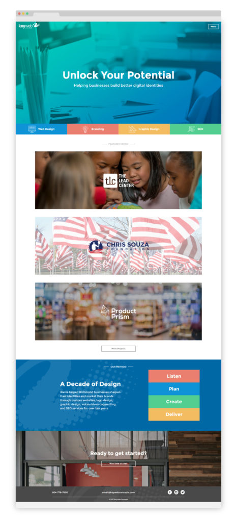
Our own recent redesign really showcases how a longer homepage can work for you. Our “above the fold” content has few words but lots of color, and what’s there gives our users our identity in a nutshell: we “help businesses build better digital identities,” and the services we offer include web design, branding, graphic design, and SEO. Upon scrolling, visitors find examples of our featured work, a brief description of our process, and an invitation to meet us for a free consultation. Each full-width section has its own visual identity, which gets the reader excited to continue scrolling and find out what’s next.
NEW VS. RETURNING VISITORS
It’s not necessary to prioritize one group of visitors over the other. A clean, comprehensive homepage should allow new visitors to explore and learn more about your company, and it’s safe to assume returning visitors will go directly to the page they need upon landing at your site.
FUNNELING YOUR USERS
This sounds much more manipulative than it really is. In theory, you shouldn’t have a lot of information on your website that isn’t important in some capacity, but there are still certain things you want your user to see, read, or interact with earlier or more often than other entities. Strategic design and calls-to-action can help you guide your users’ experience through your website and get the return you desire.
Design best practices, like using blank space to provide visual breaks or presenting essential information in a way that attracts the eye, capitalize on users’ natural tendencies to control their journey through the site. Using contrasting color, exaggerated sizing, or interesting shapes can also draw attention to specific pieces of information or calls-to-action.
Calls-to-action use graphics and/or words to compel users to complete a specific action: to sign up for a newsletter, join a program, enter an email address to receive a free trial, etc. They are often attention-grabbing buttons or full-width sections that are nearly impossible to ignore, and their verbiage should be enticing and specific to the action they are asking users to take (“sign up here” for a newsletter or membership). Stating up front the benefits to the user can also be helpful (“to receive 25% off your next order, enter your email address”).
THE BOTTOM LINE
We ended our 2010 post by emphasizing the necessity of making your purpose clear to your visitors within a few seconds of viewing. While it’s true that your website should be honest and straightforward in presenting your purpose, we know now that most users are web savvy, smart, and willing to scroll. Rather than cramming lots of information “above the fold,” try for a clean, visually-pleasing design that won’t intimidate or turn users off, then let your content unfold naturally down your homepage.
Is your homepage cluttered, outdated, or just plain ugly? We can help with that. (See what we did there? This is a call-to-action—one that hopefully entices you to check out our services!)
[post_title] => The Importance of Your Site's Homepage (2.0)
[post_excerpt] =>
[post_status] => publish
[comment_status] => open
[ping_status] => open
[post_password] =>
[post_name] => the-importance-of-your-sites-homepage-2-0
[to_ping] =>
[pinged] =>
[post_modified] => 2020-08-07 20:13:26
[post_modified_gmt] => 2020-08-07 20:13:26
[post_content_filtered] =>
[post_parent] => 0
[guid] => https://keyweb31.com/stagekwc/?p=5908
[menu_order] => 0
[post_type] => post
[post_mime_type] =>
[comment_count] => 0
[filter] => raw
)


Social Media
|
Why Every Business Needs Pinterest: 5 Foolproof Reasons
Marketing, Social Media
|
How to Use Instagram for Your Brand
Social Media
|
5 Biggest Facebook Mistakes Your Small Business Might be Making
Communication, SEO, Social Media
|
Why Social Media is Beneficial for your Business