WP_Post Object
(
[ID] => 5908
[post_author] => 1
[post_date] => 2017-01-19 13:52:05
[post_date_gmt] => 2017-01-19 18:52:05
[post_content] => We published a blog post entitled “The Importance of Your Site’s Homepage” back in 2010, and while we’ve noticed it still gets a ton of hits, we’re also here to admit that a lot has changed since then. So, as the saying goes, out with the old and in with the new: here’s a 2017 guide to your homepage.
THE BIG THREE
We’re into making things a little simpler and more streamlined these days, so we’ve cut that 2010 mega-list of 8 homepage “must-haves” down to 3:
- Establish an identity and make a good impression with a clean design that utilizes your brand colors, typeface, logo, photography style, and any other elements that showcase your company’s personality.
- Be user-friendly—highlight main attractions or pockets of information on the homepage and offer a clear navigation system. Take into consideration which pages users are likely to visit most often, and those which are necessary, but can be tucked away in a more inconspicuous location.
- Supply relevant content. Ask yourself what visitors (both new and returning) are coming to your site to see, and provide them with the useful information they’re seeking.
So what did we cut out? We decided a site-wide search tool is not necessary on all websites, fresh content doesn’t always trump relevant content, and—while we always want site visitors to read more—gimmicky “teasers” on the homepage are never a good idea.
GONE ARE THE DAYS OF “ABOVE THE FOLD”
In our 2010 post, we emphasized the notion that everything you want visitors to see on your site should be located “above the fold,” or above the 600 px mark (whatever is visible without scrolling). This concept is outdated, largely thanks to the pervasiveness of social media—in 2017, users’ first instinct upon arriving at a new website is to scroll, so the pressure to fit all content of importance within a screen-sized page is off.
There’s no doubt that you should certainly still seek to secure your users’ attention with that first screen, but there’s no need to cram in all of your relevant content. Ask yourself what you want your visitors to know about you first and also what your visitors most likely want to know: are you an architecture firm who seeks to grab new visitors with a stunning image of your most recent building? Or do you need to let your large population of returning visitors know about an event that’s just around the corner?
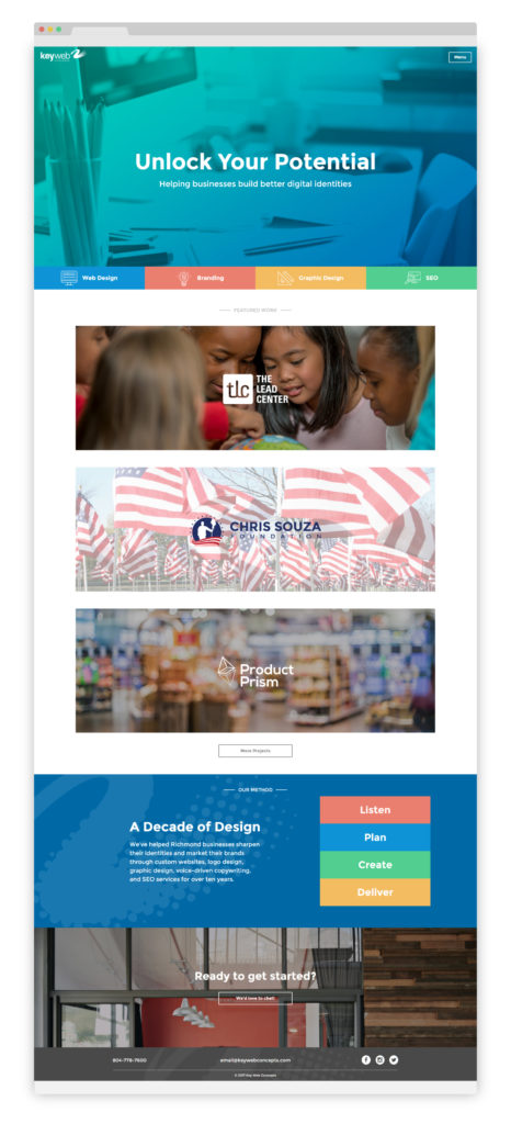
Our own recent redesign really showcases how a longer homepage can work for you. Our “above the fold” content has few words but lots of color, and what’s there gives our users our identity in a nutshell: we “help businesses build better digital identities,” and the services we offer include web design, branding, graphic design, and SEO. Upon scrolling, visitors find examples of our featured work, a brief description of our process, and an invitation to meet us for a free consultation. Each full-width section has its own visual identity, which gets the reader excited to continue scrolling and find out what’s next.
NEW VS. RETURNING VISITORS
It’s not necessary to prioritize one group of visitors over the other. A clean, comprehensive homepage should allow new visitors to explore and learn more about your company, and it’s safe to assume returning visitors will go directly to the page they need upon landing at your site.
FUNNELING YOUR USERS
This sounds much more manipulative than it really is. In theory, you shouldn’t have a lot of information on your website that isn’t important in some capacity, but there are still certain things you want your user to see, read, or interact with earlier or more often than other entities. Strategic design and calls-to-action can help you guide your users’ experience through your website and get the return you desire.
Design best practices, like using blank space to provide visual breaks or presenting essential information in a way that attracts the eye, capitalize on users’ natural tendencies to control their journey through the site. Using contrasting color, exaggerated sizing, or interesting shapes can also draw attention to specific pieces of information or calls-to-action.
Calls-to-action use graphics and/or words to compel users to complete a specific action: to sign up for a newsletter, join a program, enter an email address to receive a free trial, etc. They are often attention-grabbing buttons or full-width sections that are nearly impossible to ignore, and their verbiage should be enticing and specific to the action they are asking users to take (“sign up here” for a newsletter or membership). Stating up front the benefits to the user can also be helpful (“to receive 25% off your next order, enter your email address”).
THE BOTTOM LINE
We ended our 2010 post by emphasizing the necessity of making your purpose clear to your visitors within a few seconds of viewing. While it’s true that your website should be honest and straightforward in presenting your purpose, we know now that most users are web savvy, smart, and willing to scroll. Rather than cramming lots of information “above the fold,” try for a clean, visually-pleasing design that won’t intimidate or turn users off, then let your content unfold naturally down your homepage.
Is your homepage cluttered, outdated, or just plain ugly? We can help with that. (See what we did there? This is a call-to-action—one that hopefully entices you to check out our services!)
[post_title] => The Importance of Your Site's Homepage (2.0)
[post_excerpt] =>
[post_status] => publish
[comment_status] => open
[ping_status] => open
[post_password] =>
[post_name] => the-importance-of-your-sites-homepage-2-0
[to_ping] =>
[pinged] =>
[post_modified] => 2020-08-07 20:13:26
[post_modified_gmt] => 2020-08-07 20:13:26
[post_content_filtered] =>
[post_parent] => 0
[guid] => https://keyweb31.com/stagekwc/?p=5908
[menu_order] => 0
[post_type] => post
[post_mime_type] =>
[comment_count] => 0
[filter] => raw
)
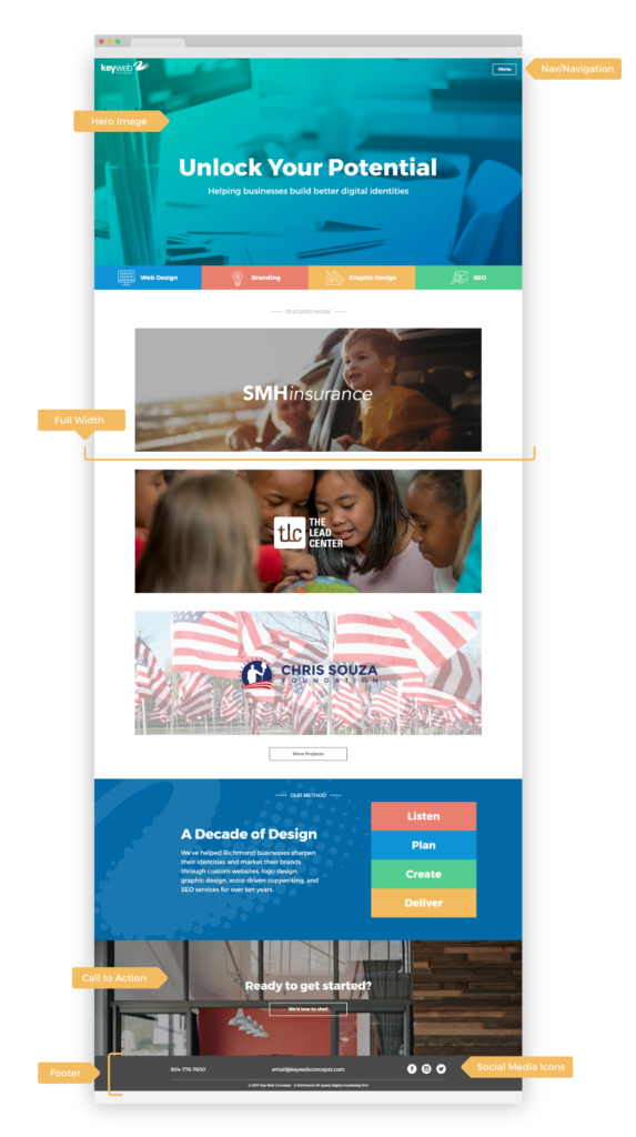 Our homepage, labeled.[/caption]


Social Media
|
Why Every Business Needs Pinterest: 5 Foolproof Reasons
Marketing, Social Media
|
How to Use Instagram for Your Brand
Social Media
|
5 Biggest Facebook Mistakes Your Small Business Might be Making
Communication, SEO, Social Media
|
Why Social Media is Beneficial for your Business