Logo Design for Cherry Tree Custom Homes
Making Room to Grow
Mick Construction was owned and operated by the Mick family as a custom home design and construction company. While they were experienced and passionate, they weren’t getting the large scale projects and types of clients they believed they were best suited for. Clearly, something had to change.
When the Mick family came to Key Web Concepts, they came with a daunting task: they wanted a new logo for their company’s rebranding, something that would represent their new image as Cherry Tree Custom Homes. Sitting down with the Micks, we found that while they had a passion for their business, they needed some guidance on how to properly convey their dedication and expertise to their clients.
Catching Custom Dreams
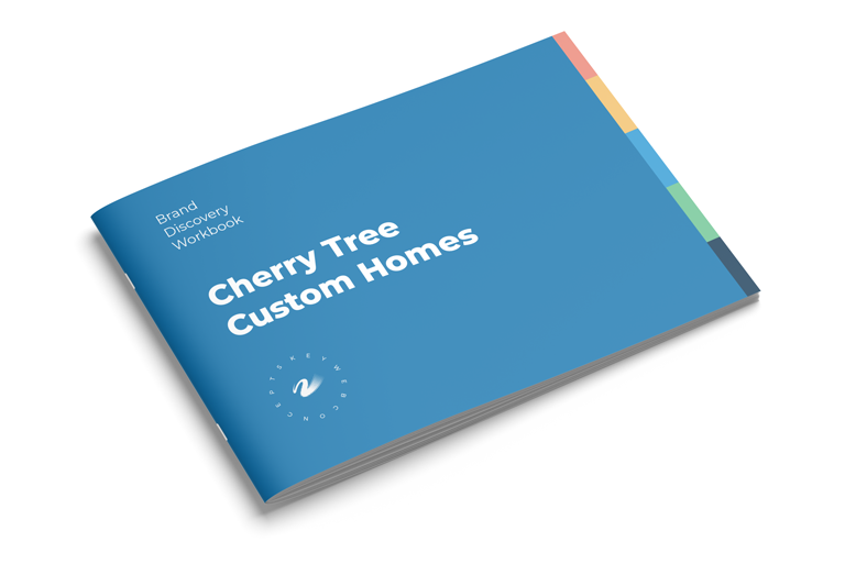
We began with our unique brand discovery session: a collaborative framework that helps us define our client’s strongest attributes, beliefs, and target market. By working directly with our clients, we make sure everyone is on the same page, so we can smoothly craft a design that lines up with our client’s dreams. The Mick family’s dream was for their home design company to appeal to creative people looking for equally talented and accomplished designers and builders to create and construct their dream homes. They wanted a logo that conveyed their experience and creativity, while also showing their craftsmanship and friendly, supportive service.
Most importantly, they wanted to make the cherry trees they’re named after a part of the logo. They admired the look and style of cherry trees and their blossoms, especially how they conveyed the traits of beauty, growth, and intelligence.
Our designer, Jono, was inspired by the family’s passion and engagement with the brand discovery exercise, serving as the ultimate springboard for his own creativity. He quickly began working on the Cherry Tree logo.
As Jono has said in the past, “This was an example of where everything goes right.”
Blossoming the Brand
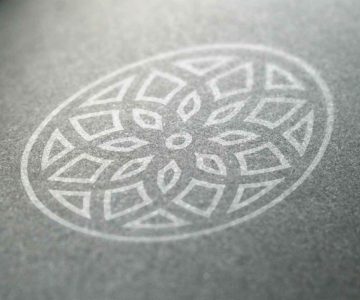
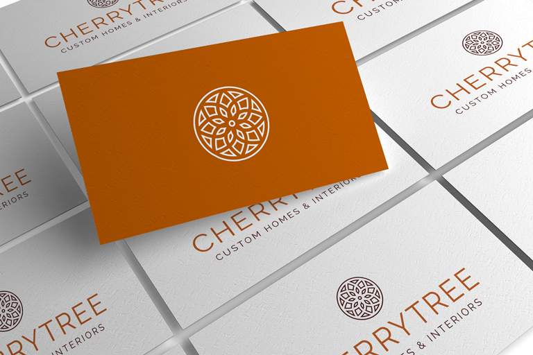
Taking into consideration everything the Mick family wanted, Jono took inspiration from two places: cherry blossoms and dreams. Jono took a cherry flower blossom design and inverted the icon, forming an intricate pattern that resembles a traditional Native American dreamcatcher. If the client has a dream, then Cherry Tree are the dreamcatchers, turning their desired homes into reality.
The cherry blossom imagery is still present, expressing growth, while the pattern is intricate, showing the company’s skills in design and managing multiple projects. It also resembles a family crest or ornament, appealing to higher-end clients while still giving off a soft, inviting impression. The appeal to these clients is further helped by the sienna color of the logo. This reddish-brown resembles refined wood, appearing rich and sturdy.
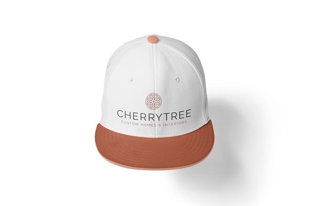
In terms of the company’s typeface, Jono chose a font that equally expresses professionalism and chicness. Each letter is thin but bold, with sharp edges that are counterbalanced by the rounded, soft-looking lines of the dreamcatcher image.
The Cherry on Top
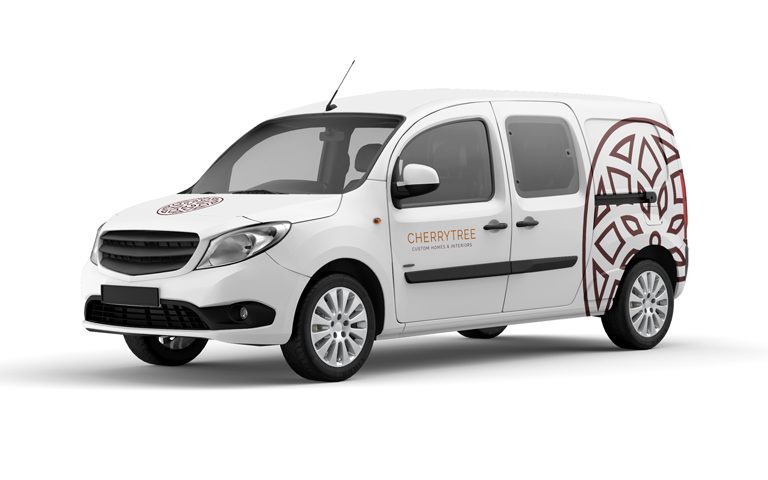
Thanks to Jono and the Mick family’s equal passion for helping people achieve their dreams, Jon was able to take the engaged answers from the brand discovery session and make a new logo that perfectly fits into the Cherry Tree brand. Cherry Tree has since attracted large-scale projects that were never offered to them before rebranding, and are often complimented on how professional and upscale their logo looks.
“This logo is exactly what we wanted, it suits us well and has gotten us larger-scale projects that we never got with our old company logo and name…The process was fast, fun, and Jono listened to us and our needs.” – Teresa Mick
